It has been ten months since the last report. We are sorry for that. However, we did not rest at all during these long months. We even worked on our in-house Framework and, we got a lot to unveil.
During the past months, we did not rest at all. We did not have time to focus on updating the blog, or, to keep up with social media. Because we did not have spare time, we could not keep you updated. The Framework proved to be a greater task than expected. We began to work on migrating the project one month ago.
Creating our Framework from scratch proved to be more time-consuming than expected. We released the first version of the Framework on GitHub more than six months after schedule. The first release was originally planned for last December before being delayed in February. We finally settled for a release in May. We spent a total of 10 months working oan the Framework!

Along the road, we stumbled on more issues than expected. We found out some features needed more polish and, other features were simply missing. The Framework is publicly available on GitHub and as a Composer package.
We only started to work on the main project recently. The work began in February. At the time, we were using an incomplete development version of the Framework. We quickly discovered that some features were missing leading us to switch our focus back on the Framework. Right after releasing the first stable build of the Framework, our focus went back to VocalVideo.
Our first goal was to find the potential issue in the current version of the website and find possible ways to improve the experience as a whole. Here is a handful of the issues we identified :
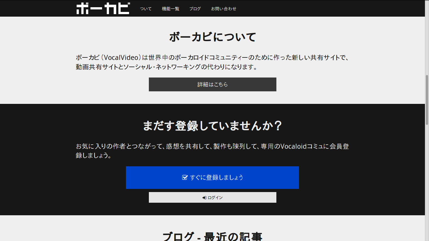
- The Homepage is not engaging;
- Forms are mysterious;
- The website is not rendered well on mobile;
- The website lacks a logo;
- The website should guide the user to the most significant action.
Next, we revised the layout of each page, made them simpler specifically for the mobile. We removed the silly background texture then crafted a more modern look. We tried to make the website more engaging by organizing the information in a more efficient way. Long story short, we decided to design pages as if they were stories you read from top to bottom then decide to leave for other parts at key moments. This simple re-thinking of the information alone greatly helped to fix most issues.
The various forms were also really hard to understand. In fact, they conveyed little to no instruction on how to fill them and were sometimes hidden. When adding some instructions and showing them by default the form suddenly became easier to fill in. However, more complex forms were still lacking some appeal. Let's examine the case of the registration form.
Along with the redesign, we plan on to add some fields to the registration. Being the most important form to attract users, it was starting to look boring and non-engaging. To increase the appeal of the registration form we opted for division and mix in some story-telling.
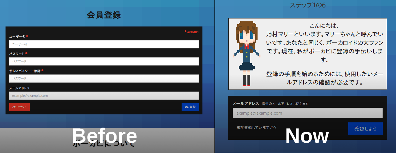
First, we divided the form into smaller more relevant parts from all the fields we wanted the users to fill in during registration. With that, we added a counter showing to the user its progression in the process. Next, we decided to go further with the story-telling idea - we created a character that would help the user to register but also elsewhere on the application. So far, we thought of a possible tutorial on upon first connection showcasing some basic features.
A lot more is coming soon and we expect to be able to push the new website in a few weeks.
Comments
There is no comment for the moment